Describe your process for
choosing and designing your book cover. Who created your cover? How did you
find him/her? What do you love about your cover? What might you do differently
next time?

A good book cover begins with its
title. If a synopsis is the summation of your book, then the title should be
the precis of this summation. I aim for a title that will get the attention of
the reader and be easy to remember, one that conveys your message and fits the
design. I prefer to use a sub title in nonfiction books, a descriptive line
that compliments title. I wouldn’t use a subtitle in a novel.

For cover design and layout I
like to place the title where it has the greatest visual impact using a strong,
good sized font and colour that compliments the graphics. I like to use a
background image that integrates with the title and easy to memorise.
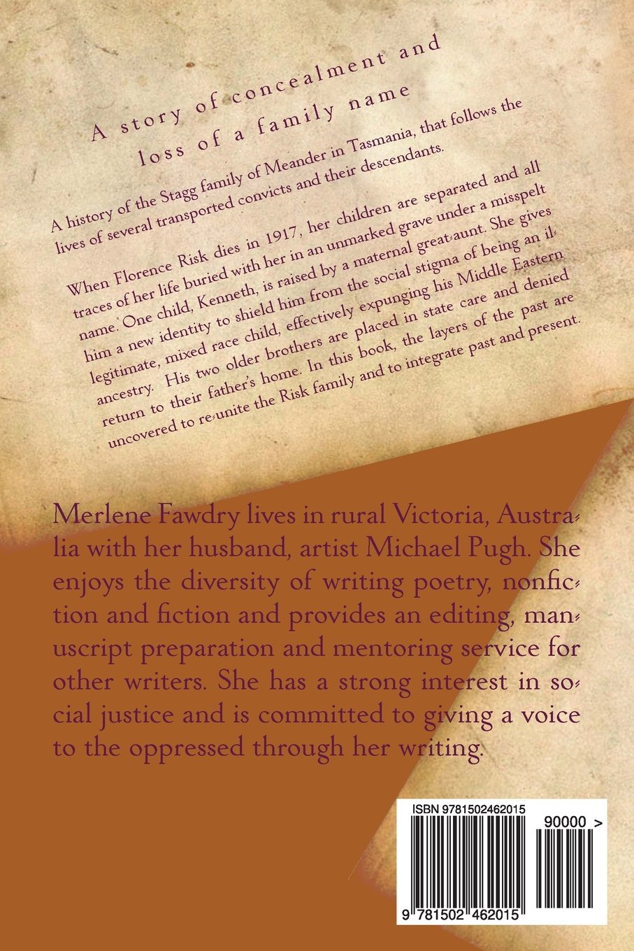
The design for the back cover for many of my books varies according to each publication and the type of book. It's pretty much instinctive and I'll play around with it until it says what I want to convey. When designing covers for other writers I use the top half of the back
cover to place a precis of the synopsis as a preview of the contents, with endorsements and reviews from pre-readers or previous editions placed below the synopsis to help add to the credibility to
the book.

Beneath this I usually place a brief
author bio, which can change from publication to publication, depending on the
content of the book, keeping this to around three sentences. In The Scent of my Mother's Kiss, I omitted this entirely in favour of adding a brief opinion piece. If the book is nonfiction
I sometimes mention my credentials or my authority to write on that subject, keeping it
more personality based for a work of fiction. I reversed this arrangement for The Hidden Risks (see below) although I'm not sure why I did this.


I place the book title on the
spine so it can be easily read sideways. If the book has a short title I will include
my author name. If the book has a sub title I don’t include this due to space
and readability restrictions.


With my nonfiction books I use my
own images and design and I’m mostly pleased with the result. My husband, Michael Pugh, is an artist
and I have used his paintings on the froint covers of The Hidden Risks and Villains and Valour,
something I'd do again if the opportunity arose as I admire his art and like the unique touch this gives to the work.
With Seth, I had the front cover designed by 111 Pixel Productions using one of their stock images against a background image of my own. I designed the back cover and wasn’t happy with the result – after printing unfortunately. The information was sparse and the font too large. I intend to edit this when I find the time.

Merlene,
ReplyDeleteWhat an interesting array of covers! Thanks for sharing how you put them together. What talent! I really like the re-do of Ionshaker. The white with the bold font really pops out. Near how you can use your husband's paintings for the non-fiction. Finally, I like the job they did on Seth. I would have never known there were two different pictures. Hope you get the back the way you like it.
Amy